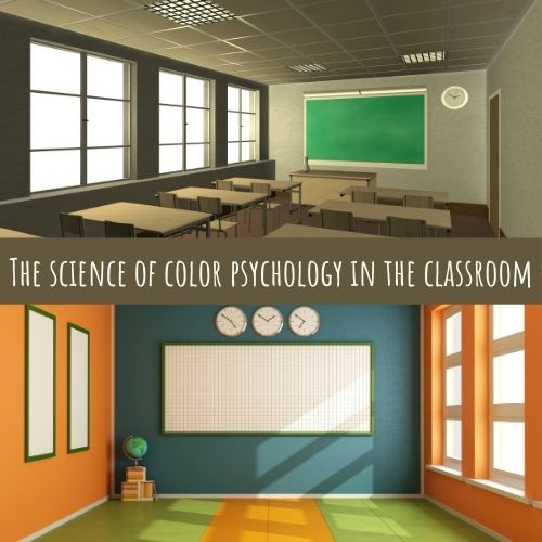
Modern-day classrooms no longer bring the feeling of being in a stark white sanitarium for a prison cell. Classrooms are encouraged to be bright and colorful, often featured student work, inspiring quotes, and soft lighting. Some schools have painted the entire building according to the science of the best colors for a classroom. That’s right. There is a science to color and how we react to it.

The science of color psychology has been widely studied among children in the learning environment. Further, classroom environments and their colors and color schemes versus student engagement have been studied in depth. Here we have provided a breakdown of the most desirable colors and color schemes for the learning environment in classrooms and school hallways.
What Is the Best Color for Learning?
Believe it or not, blue is considered to be the most desirable color for learning. Color psychology shows that this color promotes memory and enhances creativity. Certain hues of the color can have a calming effect (and who doesn’t want a class full of calm and collected students?). Blue can also be an appetite inhibitor, and too much blue in an area can bring about feelings or a mood of sadness.
What Colors Help With Learning?
Psychology shows that the effects of color can be generated from anything. Consider the colors around your school or the various colors of furniture lying around. The idea that these different hues can generate different moods is amazing! Check out each of the colors to see how to impact your school with color.
Orange
The color orange promotes a positive environment by evoking feelings of energy and excitement. While orange on every classroom wall may be a little bit too much, having splashes of color in furniture and walls can be a big plus for the classroom environment.
Red
Red is widely associated as the color of love and holidays such as Valentine’s and Christmas. On the flip side, the color red is also associated with death and blood. But in smaller doses classrooms, this color can act as a stimulant to improve performance and promote creativity in children.
The color red is one that you do not want to have too much of in any one space. One painted wall may be ok, but a whole classroom full of red may have the opposite effect on your students.
Green
Green, like its close counterpart blue, can promote mental health by providing students with stress relief and having a positive effect on concentration. Certain hues of the color paired with other earth tones and organic accents provide a very calm learning environment.
Moreover, like with any color, it is important to take into consideration the specific hue. Putting a lime hue on all the walls would be too bright and not evoke the same mood as choosing a wall color that is a softer green from nature. The right tone of this color will promote relaxation and balance in your room.
Yellow
The color yellow releases serotonin, which is a chemical in the brain that has the potential to reduce anxiety and depression. This is the same chemical that is released in the brain when you exercise. Furthermore, this color can also promote awareness of the various environments and workspace.
Like all the other colors, it’s important to pay attention to the various shades of yellow. Colors like neon yellow are too bring and can have the opposite of students’ desired impact. This hue can be incorporated into the classroom design by being incorporated into decor rather than being painted all over the walls.
White
White is a tone that is not thought of as one to put in a classroom for the simple fact that for the longest time, white classroom walls made students feel as though school was a prison. This color creates the mood or feeling of sterility...like being in a hospital.
However, warmer hues of white, such as off-white colors paired with other earth tones, have a calming effect on students and promote clear thought within schools and the classroom.
What Is the Most Calming Color for a Classroom?

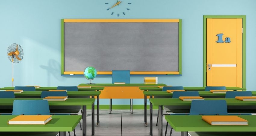
When chosen in the correct shades, various green and blue shades are the ideal color choices for a school. Many schools today design their environment to have the effects of calm and tranquillity. Because colors like this bring a sense of relaxation, creativity is needed to bring other colors into the mix.
Classroom colors can mimic the school colors and feature pops of brighter hues to bring energy, creativity, and positivity into the room design. These various paint hues each create the effect of balance and can impact students in their learning.
What Are the 3 Best Colors That Go Together?
Blue, Gray, and Green are classroom color schemes that you cannot go wrong with. The choice of including each one of these colors will impact your room in its way and also create a space that is attention-grabbing and thoughtful. Get creative and look up various social media sites that present ideas on creating a bright and thoughtful room.
Many trending pictures show calm gray room walls with classroom colors that feature accents of the other hues. Various pieces of bright-colored furniture make the room design one that grabs both students’ and teachers’ attention.
Final Thoughts
Today, many schools consider the effects that color has on space, from the classroom decor, furniture to the walls to the accent pieces that are carefully chosen to hang in the school walls. Of course, this psychology piece has businesses looking at it for many years now; the schoolhouse is just coming around.
Overall, the right color pallet on the walls paired with the right furniture, classroom rugs, and another decor can make a world of difference in how your students learn. Creating a learning space that is scientifically aesthetically pleasing is one of the most vital things in the school.


